Potential

A replicable design language for every Share surface: the shareOS mark, type, color, imagery, data, graphics, motion, and 3D.

Type
Aeonik Pro. share Bold 700, os Regular 400, tracking −0.01em, set solid.
Key
Top on the h ascender, bottom 0.19em under the baseline. Padding 0.2em, radius 0.26em, gap 0.1em.
Material
1px edge, 1px specular top, inset bevel. Over imagery it blurs the image at the thin tier.
Symbol
S at 1.6× the text size, 0.5em gap. Omit it only where the S already appears.

Surfaces

On blackSmoked key, white edge
On home bgWhite key, ink edge
On whiteThe edge carries the key
Without the SWhen the S sits nearby

Over photography

Real glassThe key blurs and saturates the photograph behind it
Place on quiet image areasWhite ink over dark frames, never across a busy edge

App chrome

Rail header18px mark and Work switcher, then New chat beside Search, as in the workspace profile. Sample interface.
Top barSame lockup on a dark surface. Sample interface.

Sizes

Display · 64px and up
Footer · 24px
Nav · 21px desktop
App chrome and mobile nav · 18px
Minimum · 16px

Compact marks

App iconS on black, square; the OS masks it
Light icon64px
Favicon32px and 16px, S alone
Product badgeThe key alone, beside an S or a name

One colour and print

Solid keyKnocked-out os, one ink
Hairline keyOutline at 0.06em, no fill
Solid, reversedWhite key, black os
Hairline, reversedScreen print, foil, embroidery

Accessibility fallbacks

DefaultBlurred key over the image
Reduced transparencyOpaque key, same edge. Preview.
More contrastOpaque key, full-ink hairline. Preview.

Clear space and minimum

Clear spaceThe height of the S on every side
16px text minimumBelow that, use the S alone

Do and don't

DoUse the locked markup
Don't capitalizeNo Share, no OS
Don't drop the keyPlain text is not the mark
Don't box shareThe key holds os only
Don't recolorBlack or white only
Don't square or pill itRadius stays 0.26em
Display · Regular 400

Share Progress

H1 · Medium 500

Human potential

H2 · Medium 500

Built from curiosity

Intro · Regular 400

We build innovative companies at the intersection of artificial intelligence and human performance.

Body · Regular 400

Some things don’t need to be perfect, but when it comes to the work, ordinary isn’t enough. Body copy sets in Regular at 18px over 1.6, ragged right, never longer than 75 characters per line.

Caption · Light 300

Technical copy and captions set in Light, never below 13px.

Black#000000
White#FFFFFF
Home bg#F1F4F5
Off white#E8E6E4
Light gray#C8CBCC
Mid gray#939799
Dark gray#5E6366
X-dark gray#2B3033
Green, light#1A743E
Green, dark#4FC482
  • State. Live, working and done, always beside a text label. 4.6:1 or more on every light surface; the dark pair takes over inside dark sections.
  • One action. At most one green button per page: white label on the light green, black label on the dark pair. Every other control is ink.
  • Never. Headlines, links, focus rings, navigation, readouts, charts, the mark or decoration.

Photostyle

Cleanroom team in hoods and goggles installing a tray of sample tubes on the Perseverance rover
HumanPeople achieving or working with frontier technology, unstaged, in real light. NASA/JPL-Caltech/KSC.
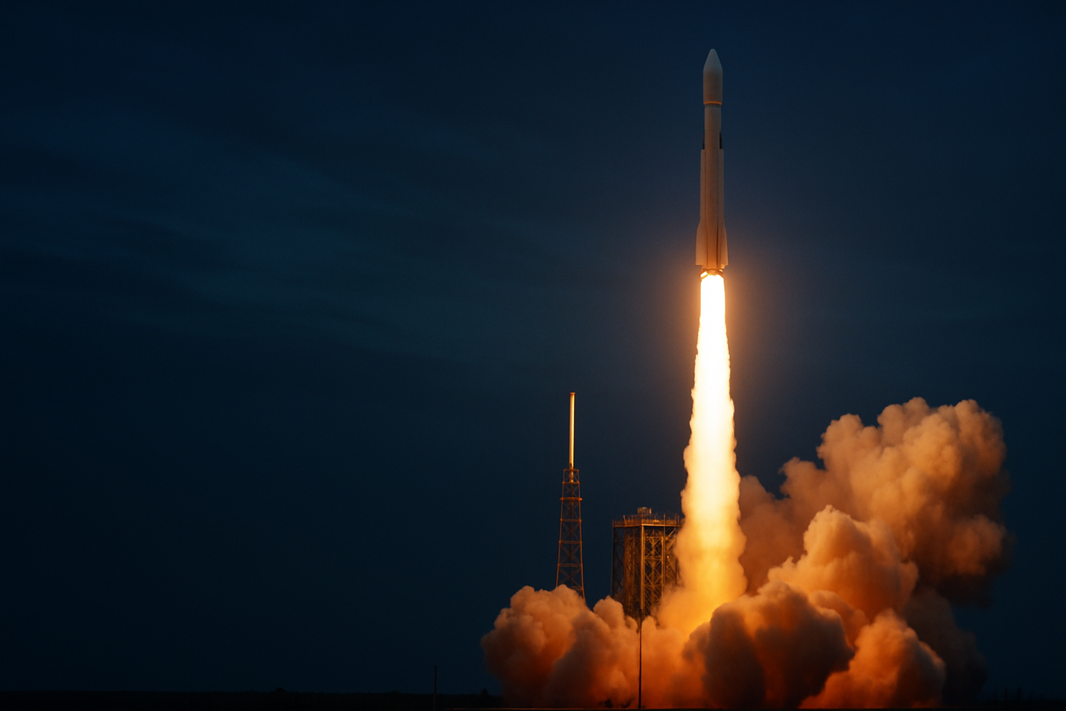
Artemis II lifting off in late daylight
AspirationalAchievement and potential: a real launch, a summit, earth from orbit. NASA/Michael DeMocker.
The Perseverance rover on Mars with the Ingenuity helicopter behind it
Forward-lookingWhat is possible: real planetary surfaces, robotics, concept hardware. NASA/JPL-Caltech/MSSS.
Machined deck of the Europa Clipper spacecraft on a cleanroom stand
QualityClean, precise, uncluttered: cleanrooms, instruments, machined detail. NASA/JPL-Caltech.

Natural color, never a cast. Authentic, sharp photographs whose own color contrasts with the black and white frame. No AI blue, no teal-and-orange grade, no generated scenes. Every file has a source, credit and usage basis in assets/images/PROVENANCE.md.

Formats

Perseverance on Mars, as a full-bleed hero

SharePotential

Full-bleed hero100svh. Headline lower left, scrim at 40% or less.
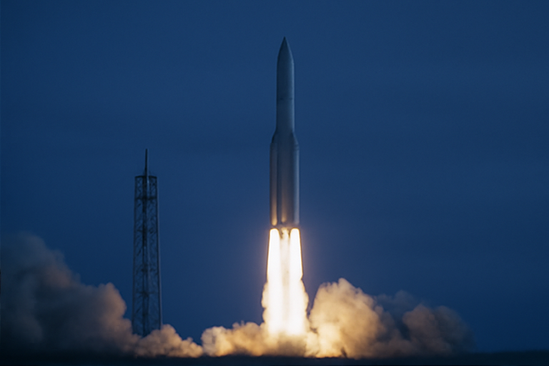
Artemis I lifting off at night, as an image band

ShareInnovation

Image band60 to 85vh with a Share ___ headline. No buttons, no body copy.
Product UIReal screens, cropped on a flat field. No device mockups, no tilt.
S supergraphic or 3D renderThe only brand object. Crop 30 to 70% and bleed off an edge; in 3D, machined metal.
LIQUID
Tiers, chosen by measured legibility
TierBlur and veilCarriesUsed on
Clear lens1px, 20% light or 26% darkA number, a word or an iconThis specimen
Thin8px, 55%Short labelsCondensed nav, section readout
Regular18px, 72%Body copy beside contentHero stat panel
Thick32px, 86%A sheet you read onMenu sheet, assistant panel and launcher
Where

Selective by rule. Floating chrome only: the condensed nav, the hero stat panel, the section readout, the menu sheet, the assistant panel and launcher, and the shareOS key. Workspaces use no glass beyond the shareOS key. Never cards, tiles, image bands, forms or a reading column. Three glass surfaces in a viewport at most.

Clear or text-safe

The clear lens spends its veil on refraction, so it carries only a number, a word or an icon. The thin, regular and thick tiers keep a measured veil and are the only glass that carries copy.

Bevel

In Chromium, an inline SVG displacement map bends the backdrop at the bezel and leaves the flat centre undistorted. A caustic ring follows the bend. The map is generated from a convex optical profile, not turbulence. Other engines keep the frosted fallback.

Ink on glass

Glass sets its own ink ramp. Page secondary grey #5E6366 drops below 4.5:1 over a 55% veil on photography, so copy on glass uses --sv-glass-ink-secondary.

Degradation

Reduced transparency, increased contrast, and engines without backdrop-filter all get an opaque surface with the same edge. The tint alphas are floors, not suggestions.

S supergraphics

Tint on blackX-dark S, 3 to 8% luminance step
Tint on lightReads as texture, not a second logo
Hairline over photography1px outline, the technical register

Layer diagram

Tokens make material. Material makes components. Components make products.

  1. ProductsshareOS, venture sites and decks, built from the kit
  2. ComponentsNav, hero, band, stat, tile, form
  3. MaterialFlat, raised and Liquid Glass surfaces
  4. TokensColour, type, space and motion values in tokens.css

Read bottom to top. Rules between layers, one black band for the foundation, one continuous spine.

Flow diagram

  1. BriefState the job of the page
  2. ComposeUse kit components and tokens
  3. VerifyMeasure contrast, glass and motion
  4. ShipOne release, one changelog line

One line carries the sequence. Nodes are icons on the line, never boxes with arrows between them.

Icons

24px grid, 2px live margin. 1.5px stroke, square terminals, mitred joins, currentColor. Shapes echo the S: 60° hexagons and diagonals, no circles or rounded ends.

  • Activity
  • Recents
  • Messages
  • People
  • Search
  • Compose
  • Sidebar
  • Layers
  • Token
  • Component
  • Surface
  • Reference
  • Chart
  • External
  • Private
  • Done
  • Add
  • Close

Pattern and texture

Hex lattice1px, 48px cells or larger, on dark behind data or diagrams. Never behind body copy.
Column rulesThe 12-column grid drawn as hairlines. For diagrams and data, not page decoration.

The numbers carry the proof

0New
companies
0mRaised

On black

Sample data · the palette lifts inside .sv-dark

Data palette

Ink--sv-data-1 · #000000
Blue--sv-data-2 · #2F5FD0
Teal--sv-data-3 · #0E7C86
Violet--sv-data-4 · #6E56CF
Amber--sv-data-5 · #B5651D
Neutral--sv-data-neutral · #5E6366
Grid and track--sv-data-grid · #C8CBCC

Charts only, never chrome. Start in ink; add hues in this order only to tell series apart. Green is not a data colour.

Bar

Sample data · index, Jan to Jun

One series is ink. Label the value that matters, not every bar.

Line and area

Sample data · two series, eight periods

Label lines at their ends, no legend. The comparison series is dashed and a second hue.

Stacked, 100%

Sample data · share of total by quarter

Three segments at most. "Other" is always neutral grey and sits last.

Donut and proportion bar

Sample data · composition of one whole

Four parts at most. The centre holds the one number that matters.

KPI tiles and sparklines

Sample metric A1,284 12% vs prior period
Sample metric B36.4 3% vs prior period
Sample metric C92% 1 pt vs prior period

Deltas are ink with a drawn arrow. No red, no green: direction is not a verdict.

Data table

Sample data. Numbers right-aligned in tabular figures; one inline bar column at most.
NameValueChangeRelative value
Sample row one4,820+8%
Sample row two3,610+3%
Sample row three2,190−2%
Sample row four1,270+11%
Artemis I lifting off from Launch Complex 39B at night


Innovation

The image band, the signature text-on-image treatment

Text link Arrow link
Newsletter row

Parts become a system

what’s next

Connect with us Open design copilot Back to top